

__________________________________________________________________
Adobe Idea Kit Marbleized ↓

|
For this project, we had to use adobe illustrator to marbleize our names using a marble background. To begin making the marbled background, we had to draw random basic shapes in different colors all overlapping in one area. Once that was done, we put the twirl tool over it to merge it all together in a spinning pattern. After all the shapes were spun together, we clipped a piece of the pattern into a square shape using the clipping mask, then added a background color. From there I added inner glow to finish off the marbled background.
Once I finished my marble background, I typed out my name in letters. For this to work out, we had to type out the text using a thick font, that way the design inside could be well seen. If we had used a smaller font the pattern would have easily been lost. After my name was typed, I added a gradient to it that matched my marble background and dragged the background over the letter. I ten used the selection tool and clipping mask to get the shape |
__________________________________________________________________
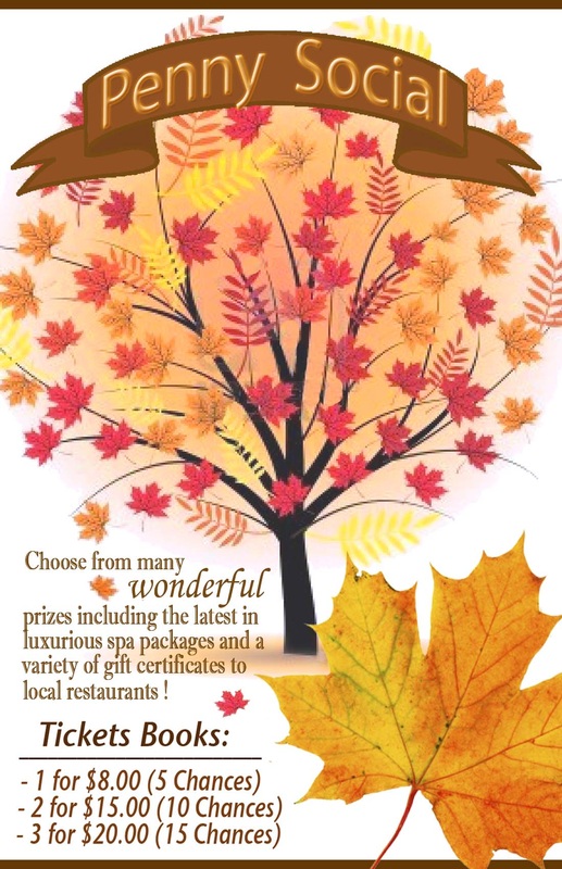
Holy Name Penny Social Posters ↓ |
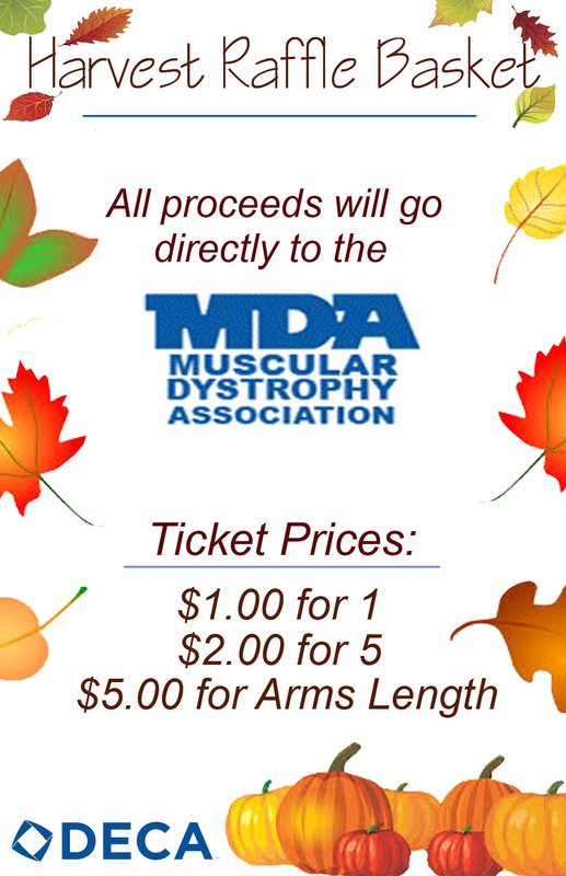
Deca Raffle Poster ↓
|

|
|
|
___
For these posters, I used Adobe Photoshop to create various effects that would make the posters appealing to people who see them. I used orange, red, and yellow colors in all 3 posters to really make sure the idea of harvest and fall came across, considering that these posters would all be used for harvest raffles. For the Deca poster I chose to add in blue underlines to match the Deca and MDA logos. I also chose to keep it simpler because Deca is more professional. For the Holy Name Penny Social posters, I chose to put a lot of harvest decals because it was more of a fun poster that had to be eye catching and exciting.
____
___________________________________________________________________
Tour - Color Stik Crayons ↓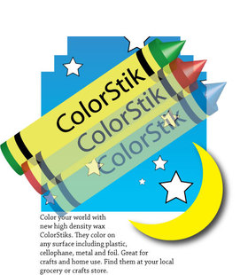
This was our first official practice in the Adobe Illustrator Classroom In A Book workbook. We had to use copy, past, direct selections, symbol shifter, clipping mask, symbol sprayer, and the 3d effect to create this ad for ColorStik crayons. Everything in this photo was made using the tools and the gradients, even the crayons, which had to be made using the 3d effect. To make them we had to revolve them until they had the proper shape.
|
Deca Fundraising Poster ↓_______-
_Using Adobe Photoshop, I was able to create a poster for Deca's fundraiser that they were having. I tried to embody the Deca website in the poster by recreating their circle design and using various shades of blues. I decided to make horizontal bars at the top overlapping in different layers to a piece that would have otherwise had too much white space. To finish I added the Deca logo, which, being blue, fit in well with the rest of the piece.
|
__________________________________________________________________
Thayer Street Tour Guide Button ↓
|
All of the graphics classes took a field trip to Thayer Street. Our assignment as Graphics 2 students was to be the tour guides.
As a quick assignment, we created buttons for us to wear to show that we were guides. I created mine in Adobe Photoshop. I started off with a basic circle and added a style to it that made it embossed with an inner glow and a gradient of a light blue to white. I then added our schools logo, the Raider symbol, into the center. From there I put the text SBRHS GUIDE, rounding them out using the warp tool to flow along with the shape of the circle. To make the words stand out a little more, I used the stylize tool on the text and customized it my own way to make it embossed, with an outer glow of light blue, a small inner glow of white, and a gradient similar to the one used on the circle: white blending into a light blue. Once on Thayer Street, I helped tour around the group that I was walking with. I gave them ideas on what stores they could go to to find things from their categories. For example, I recommended my friend go to Urban Outfitters because she had mens apparel and I knew that Urban had a whole floor dedicated to mens clothing. |
I also helped guide them on where to eat. I told them about the different places we could go and we ended up choosing Johnny Rockets. I made sure to warn them that we should go earlier because once it hit lunch time, the place would be swarmed and we wouldn't get a seat.
__________________________________________________________________
Adobe Illustrator Classroom In A Book Lessons 1 - 4 ↓

For these exercises , we got the opportunity to practice with adobe illustrator. We used tools like copy, selection tools, direct selection tools, and gradients. We had to use the direct selection tool to select multiple objects and change all of them at once to the same gradient. We also had to use the direct selection tool to select multiple lines and add different thicknesses to all of them.
___________________________________________________________________
Adobe Illustrator Pear ↓
|
For this assignment we were required to recreate a pear logo using the pen tool. Before beginning on the pear we had to learn how to use the pen tool. There were lessons on it provided where we had to learn how to make curves, make lines, connect points, and create shapes.
Once these lessons were completed we began making the pear logo by making the stem, leaf, and arrow. To make the stem and the leaf, we drew over the provided stencil using the pen tool. To make the arrow, we drew a straight line, split it in half, and added an arrowhead and an arrow-end (using the stylize feature) to both ends. When these were completed, we began on the pear. The stencil was provided: all we had to do was use the pen tool to draw over it. When all of this was done it was time to add the coloring to the pear. |
The swatches were provided, so all we had to do was apply them to the correct parts of the pear, the leaf, the steam, and the arrow. It was optional to add more detail to the stem and the leaf, so I went in zoomed and added lines on both to make them more realistic.
__________________________________________________________________
Apple Cider Remake Logo ↓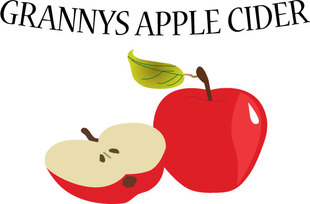
|
In this project we were required to recreate a photo of 2 apples using the tools in adobe illustrator and then use this recreation to make a logo for either apple cider or apple vinegar (I went with apple cider).
To make the apples, we had to work with the layering tool a lot. We had to make some layers semi-translucent in order to use the pen tool to trace the shape perfectly. The pen tool doesn't always come out perfectly smooth and even, especially considering this is a new tool that we are using, so once the apple outline was completed, I zoomed in very closely and altered the lines using the direct selection tool until I found it was as smooth as I could get it. |
After all the layers were smoothed out I filled the apple in with color. I decided to make a logo with a red apple. I added on some shading on the larger apple's body to give it more of a realistic look. I then went in and added a swatch to the leaf to make it a bit more interesting and less plain. Finally I included the name "Granny's Apple Cider" at the top using the text tool , and came out with the finished logo above.
__________________________________________________________________
Adobe Illustrator Classroom In A Book Lessons 5-7 ↓

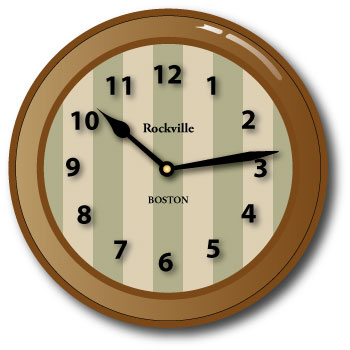
These exercises were done following the instructions given in the book. There were 3 different ones that we had to do. First we had to make changes to a simple 4 block hat design. We had to change the gradients, use different strokes and brushes, and mess with varying transparencies and styles. The next project was to remake a radio wave logo using layers, transparencies, opacity layers, and gradients. Finally, we had to make a clock using a mixture of everything we learned in the past 2 projects plus a little more. We had to use gradients, patterns, overlaying, layers, drop shadows, grouping, resizing, and pasting. Overall these 3 projects allowed us to really experiment with all the different editing you can do to a simple illustrator creation.
