___________________________________________________________________
Animations Continued ↓
|
|
The animation to the left was my clay animation. In this animation I used simply a single piece of purple clay. Throughout the animation I warped it, stretched it, squished it, and had it slither around the board. It's a very quick but technical animation. One of the most interesting parts of the animation is when the clay keeps switching from a ball to an outline of the ball. This was able to be accomplished by using the onion skin tool and positioning the clay and it's outline in the correct spots. Another cool part of the animation is when the balls of clay jump on top of each other and end up falling off the board. This gave the animation a different viewpoint and changed it from looking like an above shot to a straight on shot. |
.
|
This animation on the right was the next one that I made. This was a 3D animation, using real objects, one of which I made. The duck in the animation was made by me using various art supplies and many classes of work. I used clay for the head, cotton balls and yellow glue for the body, and wires for the body frame and the feet. Aside from the duck, there are also peeps in this video. It's meant to be an Easter themed animation because the holiday was only a week before I made this! This animation is very technical, with the peeps walking, the duck moving, and all the characters running around each other. All the colors in the animation also really add to it. I also overlaid the clip with music that had a matching tempo to the movement's the animations were making! If I were to make this again I would make it longer, the movements much less choppy, and the camera angle more consistent.
|
|
.
|
|
This animation was made as I was experimenting with different techniques to create bubbling effects. The glass ended up really not working out that great as bubbles, but it did make a really cool and technical animation. The glass is continuously moving around and is being dumped in and out of the frame and the bucket. The glass was entirely the same color, and the color scheme of the background and the plastic container also matched it, so as far as color goes this animation was very dull and monotone. However, there was plenty of texture to make up for that missing interest. The glass was glossy, some clear, some cloudy, some chipped, some scratched, and all various different shapes. There really is no plot or story line to the animation: I was just experimenting with all the different ways that simple objects can be used to create effects.
|
___________________________________________________________________
History Project Graphics Work
|
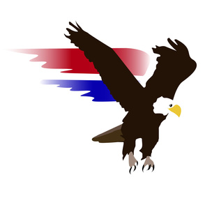
In my history class, we had to create a project where we made up a new state of Massachusetts, and my job was to create a secret police force. I named this force the Eagles, and made the logo on the left to go along with it. I made this eagle by tracing over a picture of a real eagle with the pen tool and layering in Adobe Illustrator, I tried not to get too detailed by keeping the eagle very simple and solid colored, because logos are usually very basic.
To add some color and interest, I added 2 red and white pieces flying off of the eagle's wings, signifying the act of flying and American pride. To get these pieces to look a bit more like they were flying through the air, I shaped them like wings and diffused their colors with the gradient tool. |
___________________________________________________________________
South School Crickets Banner

The South School Elementary kids were coming to make t-shirts, so I created this sign in photoshop to welcome them!
__________________________________________________________________
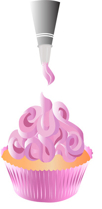
Cupcake Illustration/ Partial T-Shirt DesignI had some extra time in class, so I decided to draw a cupcake illustration in Adobe Illustrator. I didn't come up with this design myself- I traced over a photo that I had seen. Because of all of the swirls in the frosting, spelling out cupcake, I knew it'd be a challenging design to copy. I had to play around a lot with gradients and different shades of pinks to get the right coloring and to help make the words pop out more clearly. I also added gradients to the cake itself and the cup it was in in order to make the illustration more realistic! I think it came out pretty good! I've also decided that this will be one of the designs for my t-shirt!
______________________________________________________________ Special Effects ResearchI've started researching into some special effects that I can use to better my animations for next year. I will be practicing these techniques for the rest of this year, and hopefully will be able to successfully incorporate them into future projects. Some of the effect's that I have looked into are:
Consistencies:
- Keep lighting the same throughout the entire clip - Keep camera in locked/unmovable position Boiling Water: - Use clear marbles - Can also use the aqua plant balls Explosions: - Make something look lit with a red laser pointer - Make smoke out of cotton wool on wire, use the rig remover - Point bright light on the screen mid explosion to make more it more realistic - StopMotionPro.com ^ *Green Screen Backgrounds with Chroma Key* http://www.ikitmovie.com/102/Chroma-Key-Backgrounds-Webpage.htm Pixilation: - Get eaten by one object and pop out of another. - Use props to position you inside objects. |
Flames/Fire: - Slide plexi-glass behind the scene - Paint fire on to it - Use a sheet large enough that the edges aren’t in the shot - Check the shot beforehand to ensure there isn’t a reflection - Only paint the flames going forward: just reverse the shots to have it go backwards Moving Objects Through Air: - Also use plexi-glass - Use duct tape and attach things to the glass Transportation: - Move from one spinny chair to another when it spins in a full circle. |
__________________________________________________________________
Adobe Illustrator T-Shirt Designs
|
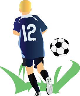
For my second t-shirt design I decided to make an adobe illustrator drawing of my younger brother playing soccer. To make this design I used the pen tool and layering to trace over a real photo of him playing. I then made my own grass and a soccer ball to add detail to the overall design.
To make this drawing look a bit more realistic, I used the gradient tool to give the effect that the object wasn't 2D. I made the shirt a mixture of dark and light blues. I made the shorts a combination of black and dark blue. I also added some slight blue gradients to the black socks. Even his hair, which is naturally almost the same color as his skin, had to be gradiented to make it appear realistic. To print out the T-Shirt, I first printed the design (through publisher) onto a piece of printer paper. I then put this paper on the shirt and pressed it down with a hot iron. I peeled it off, and the design stuck! |
|
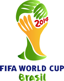
For my third and final t-shirt design, I recreated the World Cup logo using Adobe Illustrator. I'm hoping I can print it and wear it as I'm watching the games over the next few weeks! I basically just used layering and gradients to recreate this very bright and colorful logo! I also chose to not emboss the edges of the logo, even though in the real one there was a lot of dark embossing used. I chose to exclude it because of time restrictions and because I liked it better without. With the black embossing, the bright colors were toned down, and I really hated how it did that. I just wanted it to stay as colorful as it could. I did work very hard with the gradient tool to get the same look that the real logo had, as far as shading and coloring goes. The real logo was not solid yellows and greens. It would change from a dark green to a light, and same with the yellow. It looks a lot better with the gradients, so I recreated them. |
|
